
Time to be patient
‘The stock market is designed to transfer money from the active to the patient’ – Warren Buffett
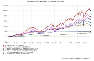
If you read nothing else in this communication please read the next couple of paragraphs and look at the first graph below. The intention of this communication is not to provide market commentary, it is simply to help put your mind at ease and to help you visualise what happens in markets long term despite the events we have seen in the past and will see again in the future.
At times it can be enjoyable to invest and at other times it can be a very uncomfortable feeling. It is natural to have moments of wishing you had invested more when markets are rising and it is equally as natural to have uncertainty and doubt as to whether you are doing the right thing when you see values of your investments fall. As financial planners, we treat your money as our money. We are careful with it. We put ourselves into your shoes and make recommendations based on our knowledge of you and your circumstances, our expertise, our experience and the data available to us. We do not make emotional financial decisions. Just now, most markets are struggling and investors are seeing negative returns. These periods of negative returns are part of the investment journey and are factored into the average growth rates that are used when looking at your ability to invest and to manage expectations. The average growth rates would be similar to a straight line return.
While the graph below which covers almost 32 years of data (run from start of data) may look like a bunch of squiggles at first glance, the main point to consider is that in simple terms, all lines have risen from the start point with bumps along the way. Looking closer you will see the periods of positive and negative returns. The longer the period of time, the smoother the line presents. The data below does not contain the portfolios you currently hold or have held in the past. This data simply shows the ‘Investment Association’ (IA) sectors that we refer to when tracking performance of risk profiled models along with the FTSE 100 which most UK clients are familiar with and that we often see reported on in the news. As a point of reference it also includes the Bank of England base rate and the UK Retail Price Index.
The reason I have shown you the graph above is to help you visualise without words, what happens to markets after multiple economic and global events.
If you choose to read on, you will see additional graphs using the same data over a 10 year and 1 year period as examples and some further information as to why, as difficult as it may feel just now and in the past when market volatility is high, we continue to say to investors to sit tight and ride it out.
Further information
Investors have seen market turbulence before in 1992, 2000, 2008, 2011, 2016, 2020 and now. This is undoubtedly a worrying time for you but invariably volatility is a short term event and markets begin to return to previous levels after a period of time. For example, the recession of 2011 saw markets bounce back within 9 months; after the fall in March 2020, when the lockdown announcement came, markets returned to their pre March levels by October 2020. The events of the last few days have some similarities to the events of 2008 when markets were in free fall at the time of the banking crisis. Once again however by late 2009 markets repeated their historical trend and recovered to their pre-crash levels.
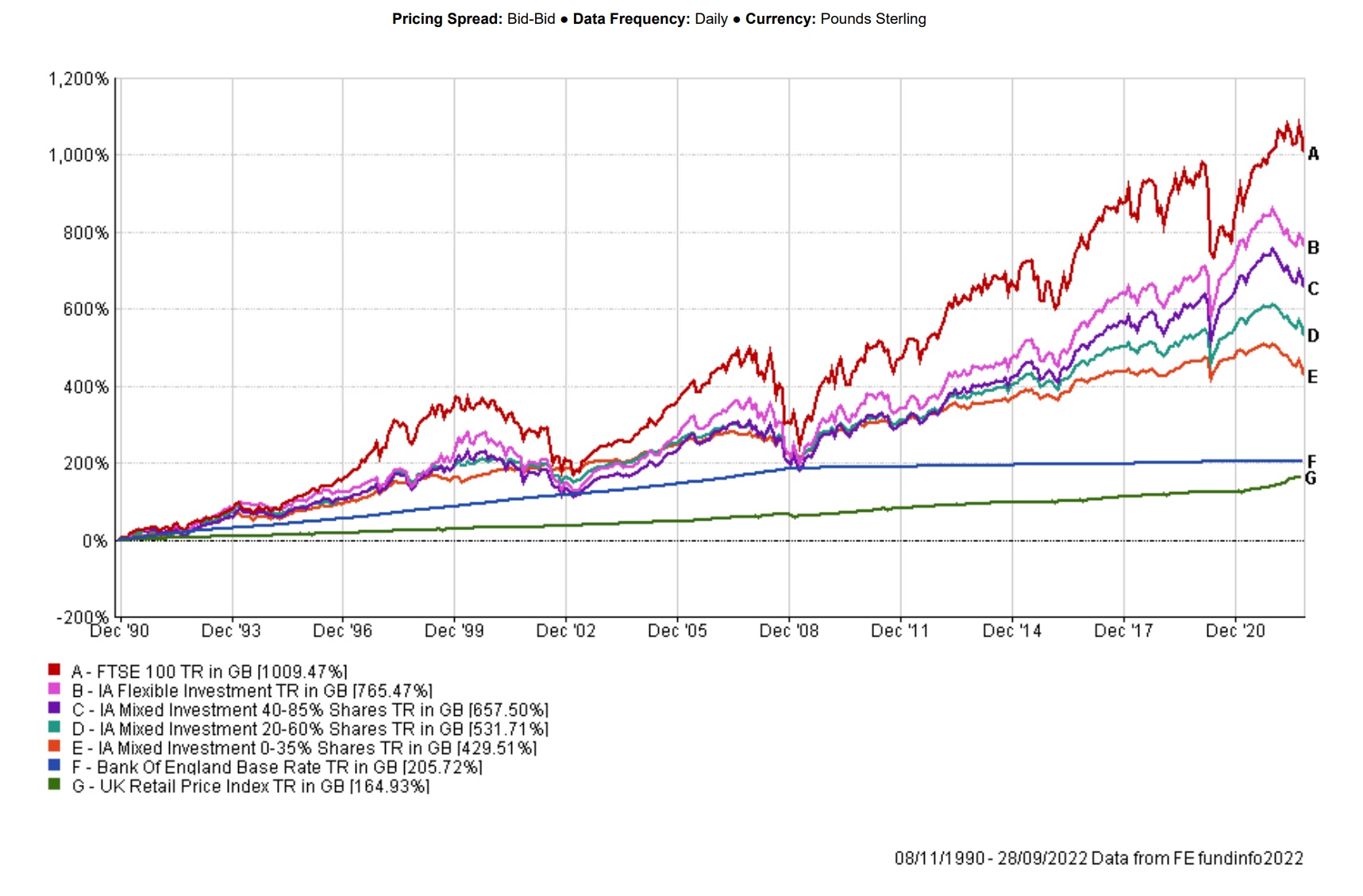
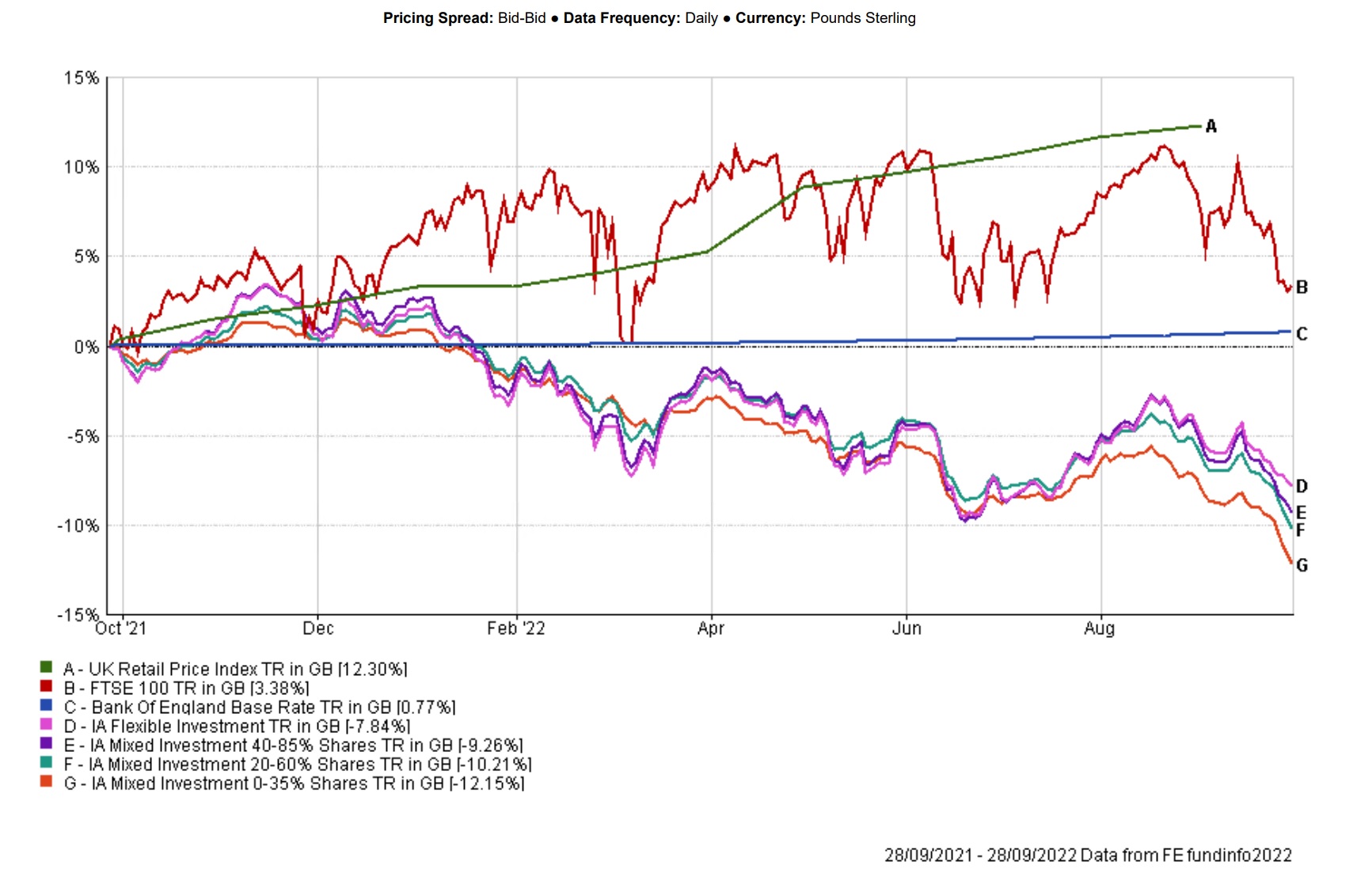
Shorter term graphs like the ones below, show how markets at time can resemble a fiddlers elbow. This chart uses the same data as the first graph going back 10 years to September 2012.
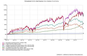
This chart uses the same data as the first graph going back 1 year to September 2021 and highlights short term volatility. It also evidences that lower risk doesn’t always mean lower losses with the lower risk sectors suffering more compared to higher risk investments.
The IA sectors, cash and FTSE 100 in order of risk from lowest to highest are;
- Cash (BOE Interest rate)
- IA Mixed Investment 0-35% Shares
- IA Mixed Investment 20-60% Shares
- IA Mixed Investment 40-85% Shares
- IA Flexible Investment
- UK FTSE 100
When we look at prospective investment returns for you as an investor, we look primarily at the expected returns for the recommended risk profile. The expected returns are based on historical data of past performance of the different asset classes within each risk profile. Essentially the data shows that lower risk equals lower potential returns with less volatility and higher risk equals higher potential returns with higher volatility. The data is presented to us as a straight line expected gross average annual return over the longer term. Real world returns can and will differ as reflected in the 1 year graph above. This is important to remember. The data however does enable us to help manage expectations and compare different solutions. We also use this indicator to help us measure the returns of the recommended investment solution to monitor its effectiveness accepting that there will be periods of under performance but over the longer term we would expect to see returns in line with and ideally ahead of the annual growth figures.
The current data shows the following returns before inflation and after typical fund charges.
|
Risk profile |
Expected annual growth |
|
Risk 3 – Low |
2.94% |
|
Risk 4 – Lowest medium |
3.98% |
|
Risk 5 – Low medium |
5.00% |
|
Risk 6 – High medium |
5.93% |
|
Risk 7 – Highest medium |
6.79% |
Our investment committee monitor actual returns achieved by our investment solutions versus expected returns to continue to track performance and identify if a change to the investment solution is needed. The investment managers carry out the underlying fund selections in order to seek out returns while continuing to manage your investment risk.
As financial planners, we want you to benefit from our guidance and reassurance that not wavering from your plan when things appear difficult is often the best outcome. We have seen markets fall and rise again in the past and will see this again as the economic cycle continues.
As Warren Buffett has been quoted as saying ‘The stock market is designed to transfer money from the active to the patient’.
Let’s continue to be patient.
This information has been prepared using all reasonable care. It is not guaranteed as to its accuracy, and it is published solely for information purposes. It is not to be construed as a solicitation or offer to buy or sell securities and does not in any way constitute investment advice.
The value of investments and income from them may go down. You may not get back the original amount invested.
Past performance is not a reliable indicator of future performance.